PROCESS HIGHLIGHT
Real Estate App
PROCESS HIGHLIGHT
Real Estate App
Project Summary
I designed with someone like Ada in mind — a young professional moving to a new city.
She doesn’t have hours to scroll through clutter.
She needs clarity. Confidence. And just enough warmth in the interface to feel seen.

The Goal
Design a mobile real estate experience that doesn't just show houses—but understands the people looking for them.
Project Summary
I designed with someone like Ada in mind — a young professional moving to a new city.
She doesn’t have hours to scroll through clutter.
She needs clarity. Confidence. And just enough warmth in the interface to feel seen.
The Goal
Design a mobile real estate experience that doesn't just show houses—but understands the people looking for them.
My Role
I handled everything from start to finish:
UX Research — I gathered insights by reviewing app store feedback from existing real estate platforms
User Flow Planning — Mapped a simplified navigation structure that prioritized clarity and ease.
UI Design — Designed four mobile screens using Figma, with a strong focus on hierarchy, whitespace, and clear actions.
Persona-driven Thinking — Created the design with a single user in mind (Ada), ensuring every design choice served her journey.
Role
UI/UX Designer
Platform
Mobile
Tools
FIigma, Figjam
Type
UI/UX Project
Core Challenges
Through reading reviews on popular real estate apps, I noticed recurring issues:
Users often felt overwhelmed by cluttered interfaces
Key information like price, ratings, and location was hard to prioritize
The homepage was often filled with too many buttons, leading to confusion
Users wanted simpler paths to save properties or contact agents
What I Did First: Research
I read through dozens of app store reviews and user feedback across different property apps. Here’s what stood out:
People wanted fewer steps to view or save listings
A clearer, more guided search bar was needed
Clarity in visuals and a sense of calm in the UI made a big difference
What I Improved
Inspired by Ada’s needs, I redesigned a simplified mobile experience:
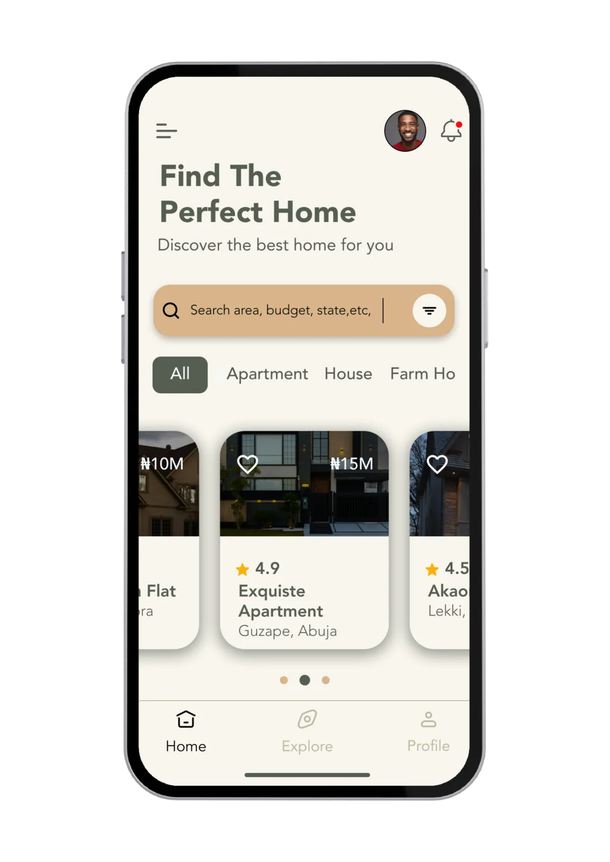
Clean Homepage: Property cards are tappable — no overload of buttons.
Guided Search Bar: Uses light examples like “Lekki” as placeholder prompts.
Visual Hierarchy: Bold pricing and rating elements and grouped icons for profile and notifications
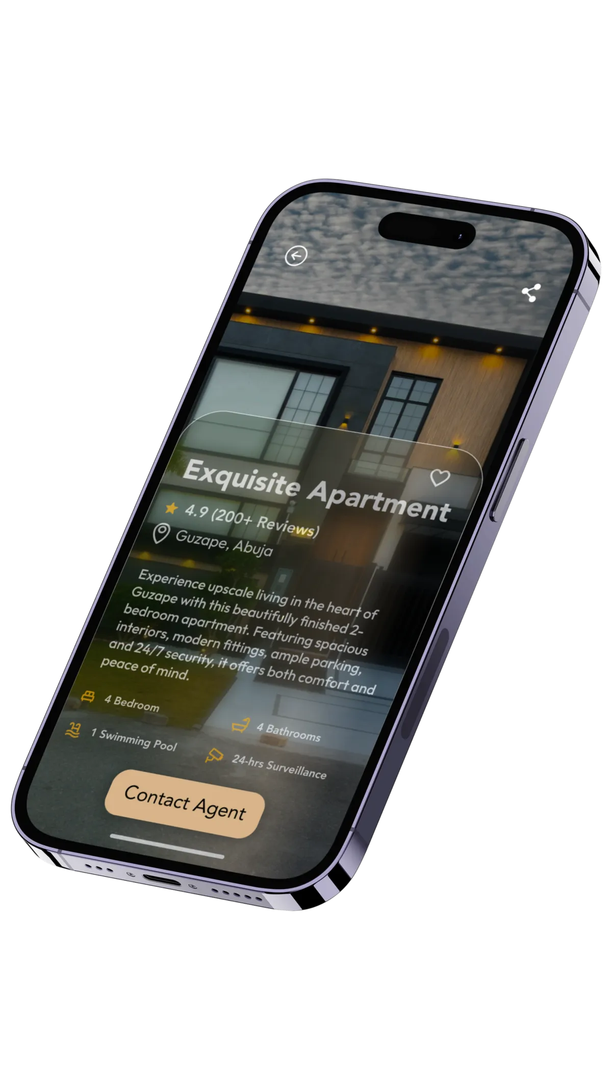
Simplified Property Detail View: Clear call-to-actions: Save, Contact Agent, View Details
Let’s Make It About the People You’re Designing For
If you're solving real problems through digital products, I’d love to hear where you’re headed and how design can help.
If you’re building something rooted in purpose and impact — let’s talk.
© Copyright John Joseph 2025 | Design by Exquisite Digital Group
Back To Top