PROCESS HIGHLIGHT
OPay UX Redesign
PROCESS HIGHLIGHT
OPay UX Redesign
Project Summary
This was a redesign project aimed at improving the OPay app — one of the most used fintech apps in Nigeria. I worked in a small team to rethink the homepage layout and key features, using a research-first approach.

The Goal
To simplify the OPay app's homepage experience, making navigation easier, reducing cognitive load, and improving overall usability — especially for users frequently transacting or searching for features like transaction history or card options.
Project Summary
This was a redesign project aimed at improving the OPay app — one of the most used fintech apps in Nigeria. I worked in a small team to rethink the homepage layout and key features, using a research-first approach.
The Goal
To simplify the OPay app's homepage experience, making navigation easier, reducing cognitive load, and improving overall usability — especially for users frequently transacting or searching for features like transaction history or card options.
My Role
My role focused on user research, idea validation, and interface clarity.
Conducted user survey & secondary research
Helped restructure the homepage for clarity
Simplified feature hierarchy
Collaborated in Figma + FigJam
Role
UI/UX Designer
Platform
Mobile
Tools
FIigma, Figjam
Type
UI/UX Project
What Was Broken?
From our heuristic evaluation and survey feedback, three main things stood out:
Too many icons at the top cluttered the visual hierarchy. The “Help” button was out of place, and the scan button added no real value.
The transaction history button was nearly invisible — more like plain text than an actual call to action.
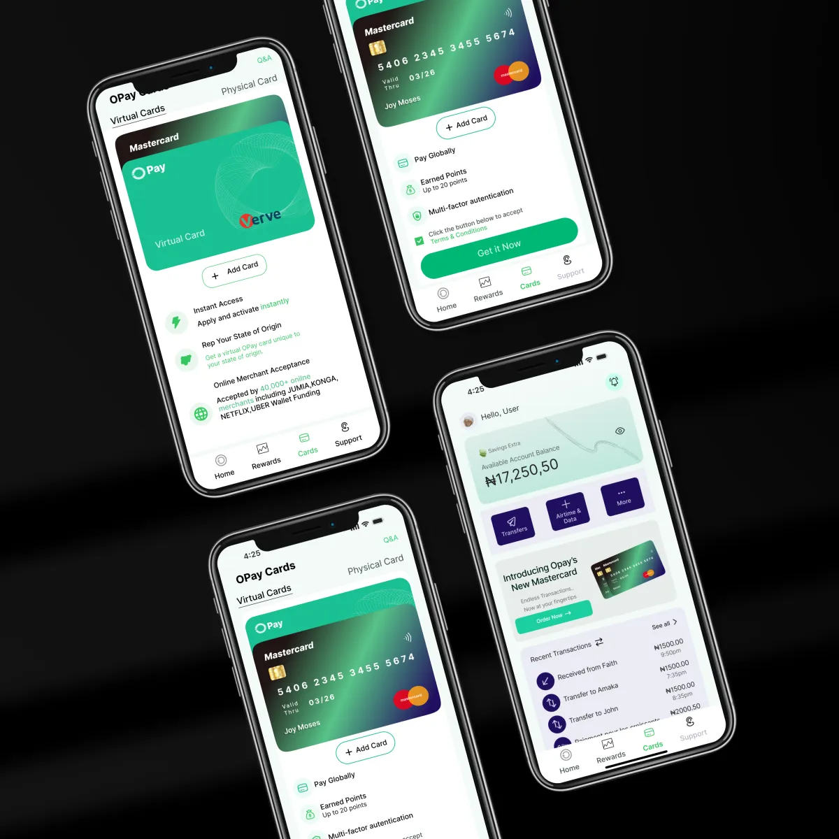
Only one card option (Verve) was available for users, which created serious limitations for payments and online transactions.
The homepage was packed with too many utility buttons that overwhelmed users instead of helping them.
What I Did First: Research
To make better decisions, I needed better context. So I began with:
Surveying real users – We collected about 15 responses, and 60% of users cited either difficulty navigating or frustration with card limitations.
Reviewing other apps like Kuda, PalmPay, and Moniepoint helped us benchmark standard experiences.
I also explored reviews from app stores to understand how users spoke about their frustrations in the wild.
What I Improved
The redesign didn’t just look better — it worked better. Fewer taps. Better visibility. And smarter focus on user priorities.
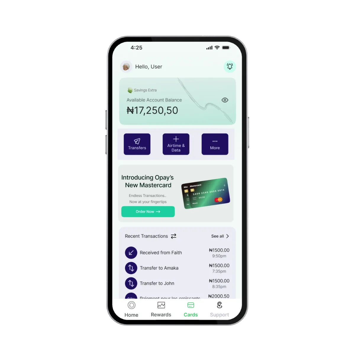
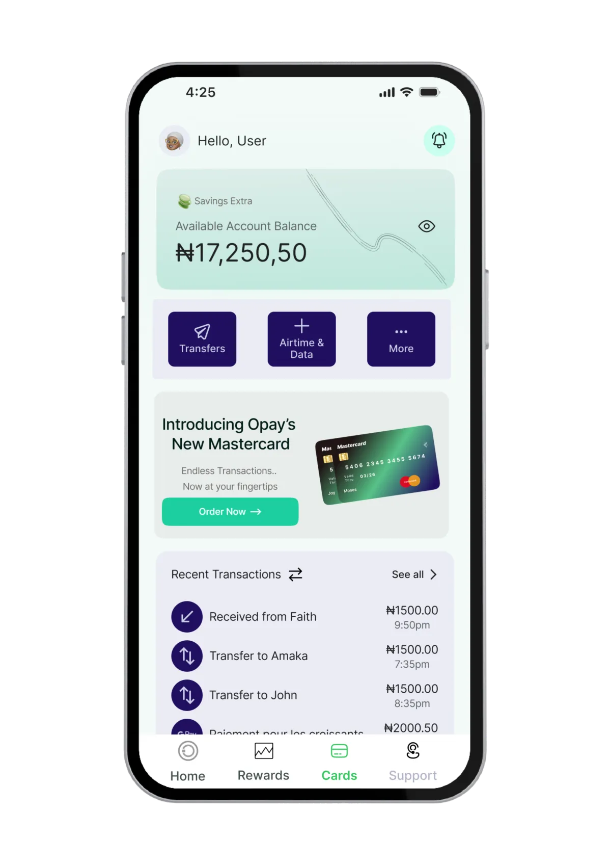
Reorganized the top navigation, keeping only what mattered
Moved “Help” to bottom nav as Support, making space for clarity
Created space to show recent transaction history on home
Grouped fintech tools into 3 main actions: Transfers, Airtime/Data, and More
Introduced MasterCard to increase payment flexibility
Let’s Make It About the People You’re Designing For
If you're solving real problems through digital products, I’d love to hear where you’re headed and how design can help.
If you’re building something rooted in purpose and impact — let’s talk.
© Copyright John Joseph 2025 | Design by Exquisite Digital Group
Back To Top